Quick Summary
To reduce product page bounce rate, start by diagnosing why shoppers are leaving before they take meaningful action. The most common causes are slow page load time, weak product images, unclear product value, poor mobile user experience, hidden shipping or return information, missing customer reviews, weak eCommerce trust signals, confusing variant selection, and a mismatch between the product page and the ad, search query, or landing page that brought the visitor there. The fastest wins usually come from improving above-the-fold clarity, adding visible social proof, making shipping and returns easy to understand, improving site speed, and giving shoppers a next step when they are not ready to buy.
In Google Analytics 4, bounce rate is the inverse of engagement rate. A bounced session is a session that was not engaged, meaning it did not last long enough, did not include a conversion event, and did not include enough page or screen views to qualify as engaged. That matters because ecommerce teams often treat bounce rate as a simple “bad page” metric when it is really a signal that the page failed to create enough relevance, confidence, or momentum.
For ecommerce leaders, product page bounce is not only a UX problem. It is a trust problem, a merchandising problem, a traffic-quality problem, and often a conversion psychology problem. A shopper who lands on a PDP and leaves quickly may not be rejecting the product. They may be rejecting uncertainty. They may not understand the product, trust the store, see the right images, find the right size, locate return policies, or feel enough confidence to continue.
The goal is not simply to make the page more attractive. The goal is to make the product page more useful at the exact moment the shopper is deciding whether to stay, click, compare, add to cart, or leave. That means strong PDP optimization combines clear product information, persuasive conversion content, fast site performance, social proof, customer reviews, UGC, trust badges, better calls to action, and a cleaner path to checkout.
What Is the Product Page Bounce Rate?
Product page bounce rate is the percentage of visitors who land on a product page and leave without taking another meaningful action, such as clicking to another page, viewing reviews, selecting a variant, engaging with product images, adding to cart, or continuing to checkout. In older analytics models, bounce rate was often treated as a single-page session metric. In Google Analytics 4, the meaning is more engagement-based. Google explains that bounce rate is the opposite of engagement rate, so a high bounce rate means a higher share of sessions were not engaged.
This distinction matters because ecommerce teams can misread the metric. A shopper who lands on a product page, stays for several minutes, reads the product description, views product images, checks shipping information, and then leaves may be more valuable than someone who clicks to another page immediately but never evaluates the product. Bounce rate needs context. It should be reviewed alongside add-to-cart rate, conversion rate, scroll depth, exit rate, product image interaction, review clicks, page load time, traffic source, and device type.
A high product page bounce rate is not always bad. Some shoppers land on a PDP from SEO, get the information they need, and leave because they are still researching. Others may bounce because the product is out of stock, too expensive, or not what they expected from the ad. The problem is when high bounce combines with low engagement, low add-to-cart rate, low product page conversion rate, and weak user engagement across similar products. That is when the page is likely failing to support the customer journey.
The right question is not “What is the bounce rate?” The better question is “Why did this visitor not find a reason to continue?” Once you frame it that way, bounce reduction becomes less about gimmicks and more about creating clarity, trust, and momentum.
Why Shoppers Bounce From Product Pages
Shoppers bounce from product pages when the page fails to meet their expectations quickly enough. Sometimes the problem is technical, such as slow page load time, poor Core Web Vitals, broken links, heavy scripts, or mobile layout issues. Sometimes the problem is strategic: the product page does not match the search query, landing pages overpromise, shoppable ads send visitors to a weak PDP, or the product description does not explain why the product is worth buying. Other times, the issue is trust: the shopper cannot find reviews, shipping details, return policies, secure checkout reassurance, or credible social proof.
A practical diagnostic table looks like this:
| Bounce Cause | What It Looks Like | How to Fix It |
| Slow page speed | Users leave before page loads | Compress images, reduce scripts, lazy-load below-fold content |
| Weak product images | Shoppers cannot evaluate the product | Add multiple photos, zoom, video, and real customer images |
| Unclear value proposition | Product feels generic or overpriced | Improve headline, benefits, comparison, and proof |
| Hidden shipping costs | Users fear surprise fees | Show delivery cost and timing before checkout |
| No reviews or social proof | Page feels risky | Add ratings, reviews, UGC, and testimonials |
| Poor mobile UX | Users struggle to browse or buy | Improve layout, buttons, sticky add-to-cart, and tap targets |
| Confusing variants | Size, colour, or options are unclear | Add variant images, fit guides, and size help |
| Weak trust signals | Users doubt the store | Add returns, warranty, secure checkout, and contact details |
| Mismatch with traffic source | Ad or search promise does not match PDP | Align page content with keyword, ad, or campaign |
| Out-of-stock product | Users cannot buy | Add back-in-stock alerts, alternatives, or pre order options |
The important point is that bounce rate is usually a symptom, not the root cause. A shopper who leaves after three seconds may be responding to slow site performance. A shopper who leaves after viewing the size selector may be responding to fit uncertainty. A shopper who exits after reading the product page may be responding to price, weak proof, or unclear return policies. The fix depends on the moment where confidence breaks.
Baymard’s product page UX research reinforces this point. Baymard has found that many ecommerce product pages still have mediocre or worse UX, and that users in testing often abandoned suitable products because of resolvable UX issues. That is the core opportunity: many product page bounces are not inevitable. They happen because the page fails to answer the shopper’s next question.
Start With Diagnosis Before Recommendations
Before changing a product page, understand why people are leaving. This is where experienced ecommerce teams separate symptoms from causes. A high bounce rate from cold paid traffic may mean the campaign is too broad. A high bounce rate from organic search may mean the page does not satisfy the search intent. A high mobile bounce rate may point to page load time, intrusive popups, poor tap targets, or a product gallery that is hard to use.
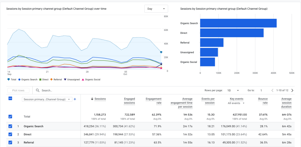
Start with Google Analytics 4 and look beyond the headline bounce rate. Review engagement rate, add-to-cart rate, conversion rate, scroll depth, product image interaction, variant selection, review clicks, exit rate, device breakdown, traffic source, page load time, and out-of-stock rate. A PDP with high bounce but strong add-to-cart among engaged users may have a traffic-quality issue. A PDP with high bounce and low engagement across all channels likely has a page experience issue.
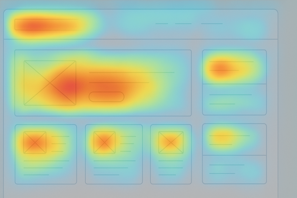
Then use heatmaps and session recordings through tools such as Hotjar to understand user behavior. Look for rage clicks, dead clicks, scroll stopping points, mobile users struggling with variant selection, users searching for size or shipping details, and clicks on elements that are not interactive. Heatmaps will not tell you why every shopper left, but they can show where attention breaks down. That makes them useful for prioritizing tests.
A helpful diagnostic workflow is:
- Check analytics for bounce rate, engagement rate, add-to-cart rate, conversion rate, scroll depth, exit rate, and device split.
- Compare high-bounce and low-bounce PDPs in the same category.
- Review traffic sources and campaign promises.
- Test page load time using PageSpeed Insights.
- Watch session recordings and heatmaps.
- Check inventory, pricing, variants, reviews, shipping, and returns.
- Identify whether the issue is relevance, trust, usability, speed, or offer clarity.
This process prevents random optimization. It keeps the team from adding an exit-intent pop-up when the real issue is slow site speed, or redesigning product images when the real issue is paid traffic mismatch. Diagnosis protects both time and conversion rate.
Product Page Bounce Rate Reduction Checklist
A good bounce reduction checklist should cover clarity, trust, speed, visuals, mobile UX, and next-step design. The goal is not to add every possible module. The goal is to make the first few seconds of the PDP feel relevant, credible, and easy to act on.
| Improvement | Where to Add It | Why It Reduces Bounce |
| Clear product title | Above the fold | Confirms the shopper is in the right place |
| Strong product images | Gallery | Helps users evaluate quickly |
| Customer reviews | Near title and review section | Builds trust |
| Shipping estimate | Near price or add-to-cart | Reduces uncertainty |
| Return policy summary | Near add-to-cart | Lowers purchase risk |
| Sticky add-to-cart | Mobile and long PDPs | Keeps next action visible |
| Size or fit guide | Near variant selector | Prevents hesitation |
| Product benefits | Near top description | Explains why to buy |
| UGC photos/videos | Gallery or below images | Shows real-world use |
| FAQ accordion | Below product details | Answers objections |
| Related products | Lower page or out-of-stock PDPs | Keeps users browsing |
| Faster page speed | Sitewide/PDP template | Prevents early exits |
This checklist is useful because it covers the main reasons shoppers leave. A product page has to confirm relevance, create desire, reduce risk, and show a clear next step. If any one of those is missing, bounce can rise.
For ecommerce leaders, the decision-making rationale matters. A sticky add-to-cart button may help if mobile shoppers scroll deeply but fail to return to the CTA. It will not fix weak product value. UGC may help if shoppers need real-life proof. It will not fix poor traffic targeting. Faster page load time may reduce early exits. It will not fix missing return information. Each fix should map to the friction it is meant to solve.
Improve Above-the-Fold Product Page Clarity
The first screen of a product page should quickly answer five questions: What is this product? What does it cost? Why should I care? Can I trust it? What should I do next? If shoppers have to work too hard to answer those questions, they may leave before the page has a chance to persuade them. This is especially true on mobile, where the first viewport is limited and attention is fragile.
Above-the-fold elements should include:
- Product name
- Price
- Main product image
- Rating and review count
- Short benefit statement
- Variant selector
- Delivery or shipping summary
- Return reassurance
- Add-to-cart button
- Stock status where relevant
A stronger above-the-fold experience might say: “Rated 4.8/5 by 1,240 customers. Free delivery by Friday. 30-day returns.” That small trust row can do more for user engagement than a vague brand statement because it answers real purchase concerns. It confirms social proof, delivery timing, and risk reversal before the shopper has to search.
What breaks when above-the-fold clarity is weak is orientation. The visitor may not immediately know whether they landed in the right place, whether the item is available, whether the price is justified, or whether the brand is trustworthy. A product page does not need to answer every question above the fold, but it needs to give the shopper enough confidence to keep going.
Match the Product Page to Search and Ad Intent
A product page often bounces because the visitor expected something different. The ad promised one thing, the PDP emphasized another, or the search result matched a query that the product page does not satisfy well enough. This is common when ecommerce teams send paid social, shoppable ads, Google Shopping, influencer traffic, SEO traffic, and email campaigns to the same generic PDP without adapting the page experience.
For organic search traffic, the product page should align with the keyword and intent. For paid traffic, the ad promise should appear quickly on the page. If an ad promotes “wide fit black heels,” the PDP needs width details, fit reviews, customer photos, and a return policy. If the query is “small apartment sofa,” the PDP needs dimensions, room-scale images, delivery details, assembly information, and customer photos from real homes.
A few examples:
| Visitor Expected | PDP Should Show |
| Waterproof hiking jacket | Waterproof rating, outdoor photos, weather use cases |
| Wide fit black heels | Width details, fit reviews, customer photos, return policy |
| Vegan protein powder chocolate | Ingredients, flavour reviews, nutrition facts, certifications |
| Small apartment sofa | Dimensions, room photos, delivery details, assembly info |
This is why landing pages and product pages need to work together. A campaign can generate traffic, but the PDP has to confirm the promise. When there is a mismatch, bounce rate rises because the shopper feels misled or unsupported. When the page reflects the intent that brought the visitor there, the shopper is more likely to continue.
Add Trust Signals Near the Add-to-Cart Button

Trust signals should appear before the shopper has to make a decision. Too many ecommerce stores bury reassurance in the footer, policy pages, or checkout flow. By then, the shopper may already have left. The add-to-cart area is where hesitation becomes most visible, so it is also where trust signals are most valuable.
Useful trust signals include:
- Star rating and review count
- Verified customer reviews
- Shipping estimate
- Return or exchange summary
- Secure payment reassurance
- Warranty or guarantee
- Contact or support link
- Stock status
- Payment options
- Trust badges where credible and specific
A strong trust row might say: “In stock. Ships in 24 hours. Free returns within 30 days. Secure checkout with PayPal, Apple Pay, Visa, and Mastercard.” This is stronger than a generic trust badge because it gives specific reassurance. The shopper knows the item is available, when it ships, what happens if it does not work, and how payment is protected.
Baymard’s UX statistics are useful here because they show how often return information is either missing or hard to understand on product pages. If shoppers cannot find return policies, delivery information, or secure checkout reassurance, they may leave to look elsewhere. Trust signals reduce bounce by preventing that external search.
Use Better Product Images, Videos, and Visual UGC
Weak visuals are one of the fastest ways to lose a shopper. Product images are often the first thing users evaluate, especially in fashion, beauty, home, lifestyle, and consumer goods categories. If images are low-quality, limited, inconsistent, slow to load, or disconnected from the selected variant, the product page can feel unreliable. Shoppers may bounce because they cannot evaluate the product confidently.
Strong visual PDP content can include:
- Multiple product angles
- Zoomable images
- Lifestyle photos
- Scale or context photos
- Product videos
- Variant-specific images
- Customer photos
- Before-and-after images where appropriate
- 360-degree views for complex products
- Shoppable videos
- UGC galleries
For fashion pdps, include fit and body-type examples. For home products, include room-scale images. For beauty, include shade, texture, and skin tone examples. For electronics, include setup and use-case images. Each visual should answer a buying question rather than simply fill a carousel.
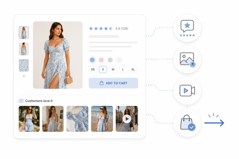
This is where using UGC becomes powerful. Customer photos and UGC videos show the product in real-world settings, which can reduce product page bounce by giving shoppers more reasons to stay. UGC on PDPs is especially valuable when the shopper needs proof that the product looks, fits, performs, or styles the way the brand claims. A polished brand image creates desire; user-generated content helps validate that desire.
Make Reviews and UGC Easy to Find
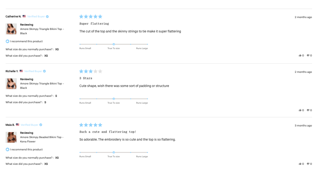
A product page with hidden or absent reviews can feel risky. Customer reviews, testimonials, star ratings, and visual UGC give shoppers evidence from people who have already bought the product. This matters because brand copy alone is usually not enough to overcome uncertainty. Reviews and UGC help shoppers see whether the product experience matches the promise.
Strong review and UGC implementation should include:
- Rating near the product title
- Review count linked to the review section
- Verified buyer labels
- Review filters
- Customer photos and videos
- Review summaries
- Common pros and cons
- Recent reviews
- Product-variant reviews
- Product-specific shoppable instagram feeds
A useful review summary might say: “Customers mention true-to-size fit, soft fabric, and fast delivery. Some petite customers say the length runs long.” Balanced summaries build more trust than only positive claims. They help shoppers choose correctly and reduce the feeling that the brand is hiding tradeoffs.
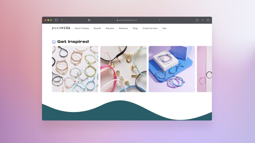
Foursixty’s case studies show how visual UGC and shoppable content can influence engagement and revenue when integrated into the ecommerce journey. Pura Vida used Foursixty-powered shoppable galleries and saw a 34% bounce rate reduction, 73% more page views, an 18.2% click-through rate among users interacting with shoppable photos, and 17% of online revenue generated through Foursixty engagement. The lesson is not just that UGC increase commerce conversions. The lesson is that product-relevant social proof can keep shoppers engaged long enough to evaluate and buy.
Make Shipping, Returns, and Delivery Clear
Many shoppers bounce because they cannot find basic purchase information. They want to know what shipping costs, when the order will arrive, whether returns are easy, whether exchanges are available, and whether duties or taxes apply. If they have to wait until checkout to discover those details, the product page creates anxiety instead of confidence.
Place this information near the price or add-to-cart button:
- Shipping cost
- Delivery estimate
- Free shipping threshold
- Return window
- Exchange policy
- International shipping availability
- Duties or taxes where relevant
- Warranty or money-back guarantee where relevant
A clear message might say: “Free shipping over $50. Estimated delivery: June 7–10. 30-day returns.” That sentence gives the shopper enough confidence to continue without forcing them to read a policy page. The full return policies can still be linked, but the PDP should include the summary version.
What breaks when this information is hidden is trust. The shopper may assume there are surprise fees, restrictive returns, or unclear fulfilment practices. That uncertainty often leads to cart abandonment later, but it can also cause bounce before the shopper ever adds to cart.
Improve Mobile PDP UX
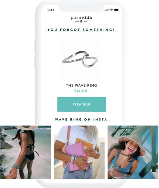
Many ecommerce visits happen on mobile, so mobile product page UX deserves separate attention. A page can look good on desktop and still perform poorly on mobile because the image gallery is heavy, the variant selector is hard to use, popups interrupt the first view, or the add-to-cart button disappears after the first scroll. Mobile shoppers are often less patient, especially if they arrive from Instagram, TikTok, shoppable social, or email.
Mobile improvements include:
- Sticky add-to-cart button
- Fast-loading images
- Large tap targets
- Visible price and variant selector
- Easy image swiping
- Collapsed but clear product details
- Reviews accessible without excessive scrolling
- Payment buttons that do not crowd the screen
- Minimal popups
- Clear error messages for size or variant selection
- Fast access to shipping and returns
The most important mobile principle is continuity. The shopper should always know what product they are viewing, what option they selected, what the next step is, and where to find reassurance. If the experience becomes disorienting, bounce increases. If the page makes evaluation easy, shoppers stay engaged longer.
Exit-intent pop-ups should be used carefully. They can help recover some users, but intrusive popups can also increase bounce, especially on mobile. A discount popup that appears before the shopper understands the product can feel like an interruption. It is often better to first fix clarity, trust, speed, and usability before layering on popups.
Reduce Page Speed Problems
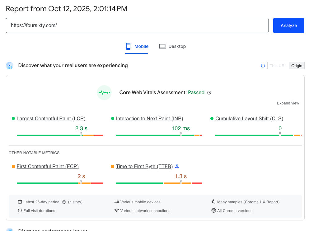
Slow PDPs can increase bounce because users leave before they can evaluate the product. This is especially common on ecommerce sites with heavy product images, review widgets, video modules, social feeds, recommendation engines, analytics scripts, and multiple third-party apps. Every app or script may have a business case, but together they can damage site performance.
Key improvements include:
- Compress product images.
- Use modern image formats.
- Lazy-load below-the-fold images and videos.
- Remove unnecessary apps or scripts.
- Defer non-critical JavaScript.
- Limit heavy social widgets.
- Optimize review and UGC modules.
- Use a CDN.
- Test mobile performance, not only desktop.
- Monitor Core Web Vitals.
PageSpeed Insights is a useful diagnostic tool because it evaluates performance and surfaces opportunities for improvement. Google’s PageSpeed documentation also connects performance analysis to Core Web Vitals, including LCP, INP, and CLS. These metrics matter because poor site performance affects user experience before the shopper ever reaches the product content.
The tradeoff is that not every script is bad. Reviews, UGC, personalization, shoppable content, and analytics can all support conversion. The goal is not to remove everything. The goal is to decide which elements earn their weight on the page. A slow Instagram feed that does not affect conversion should be reconsidered. A product-specific shoppable UGC module that reduces bounce and improves add-to-cart rate may justify its footprint if implemented efficiently.
Add Product FAQs to Handle Objections
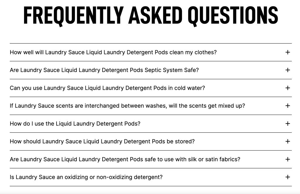
A concise FAQ section can stop users from leaving to look for answers elsewhere. Product descriptions are often written to sell, while FAQs are written to resolve objections. That makes them especially useful on higher-consideration products, products with sizing or compatibility concerns, or categories where shipping, returns, ingredients, assembly, or warranty details matter.
Good PDP FAQ topics include:
- Sizing
- Materials
- Compatibility
- Shipping
- Returns
- Warranty
- Care instructions
- Ingredients
- Assembly
- What is included
- Safety or certifications
For example, a fashion PDP might answer: “Does this jacket run true to size?” A useful response would be: “Most customers say it runs true to size. If you are between sizes or want to layer underneath, consider sizing up.” That answer works because it combines product guidance with customer feedback.
FAQs also support SEO when they answer real product-specific questions. But the main conversion value is reducing uncertainty. If shoppers cannot find answers quickly, they may leave the product page, search Google, check Reddit, message support, or compare competitors. A focused FAQ keeps the decision on the PDP.
Give Users a Next Step When They Are Not Ready to Buy
Not every visitor is ready to add to cart. Some are comparing options, waiting for payday, checking sizes, looking for reviews, or still deciding whether the product fits their needs. If the only visible next step is immediate purchase, uncertain shoppers may bounce. A better product page gives them productive alternatives.
Useful alternatives include:
- Save to wishlist
- Compare similar products
- View size guide
- Ask a question
- Chat with support
- Email product to self
- Back-in-stock alert
- Price-drop alert
- Related products
- Complete-the-look recommendations
- Buying guide link
- Product recommendations
- “You may also like” modules
This matters because bounce is often a failure to offer the next best action. A shopper who is not ready to buy might still be willing to view customer photos, read reviews, compare variants, sign up for a back-in-stock alert, or browse related products. These actions preserve engagement and give the brand another chance to convert later.
For out-of-stock PDPs, this is especially important. Sending a shopper to a dead end wastes demand. Add alternatives, preorder options, back-in-stock alerts, similar products, or shoppable content showing related items. The goal is to keep product discovery moving.
How Shoppable Content Helps Reduce Product Page Bounce
Shoppable content helps reduce product page bounce when it gives shoppers more context and a direct path to action. A generic instagram feed may make the page feel active, but it may not answer a buying question. Product-specific shoppable posts, shoppable videos, and shoppable instagram feeds do a different job. They show the product in use and make the content actionable.
This is especially relevant for brands using UGC Marketing, influencer content, Instagram monetization, Tiktok monetization, shoppable ads, and social shopping. If traffic arrives from social platforms, the PDP should preserve the visual context that created interest. A shopper who clicks from a reel or ad into a static product page can feel a disconnect. A shopper who lands on a PDP with relevant UGC, social proof, and shoppable content sees continuity.
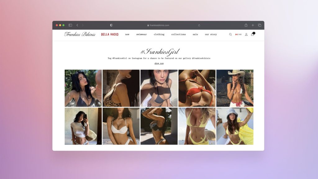
Frankies Bikinis is a useful example. The brand used Foursixty to power shoppable Instagram content across its site, with top-performing UGC placed in key locations. The result: 19% of total orders and more than 23% of online revenue were driven by Foursixty. For fashion, swimwear, beauty, and lifestyle brands, this shows why shoppable social can be more than a brand awareness tactic. It can become conversion content.

MICHI offers another angle. The brand wanted shoppable Instagram and user-generated content that matched its innovation-focused experience. Foursixty helped implement one of its most advanced integrations in half a day, and within 30 days MICHI generated a 51x ROI compared with the previous competing platform. For teams comparing Foursixty Alternatives, Yotpo, and other social commerce platforms, the lesson is that platform choice should reflect the job to be done: reviews, visual UGC, rights management, PDP placement, shoppable content, or revenue attribution.
Product Page Bounce Reduction Templates
Above-the-Fold Template
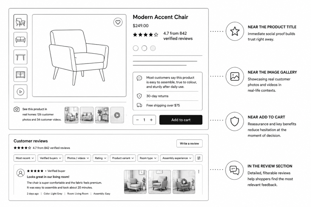
[Product Name]
★★★★☆ 4.8 from 1,240 verified reviews
Short benefit statement:
Lightweight waterproof jacket built for daily rain, commuting, and weekend hikes.
Trust row:
In stock | Ships by June 5 | 30-day returns | Secure checkout
Primary CTA:
Add to Cart
Secondary support:
Find your size | View customer photos | Ask a question
This template works because it gives the shopper immediate clarity, trust, and action. It does not rely on a long product description to explain value. It uses the first screen to confirm relevance and reduce anxiety.
Review Summary Template
What customers say:
Fit: 73% say true to size
Quality: Customers mention durable seams and soft lining
Best for: Rainy commutes and light hiking
Note: Some customers recommend sizing up for layering
This works because it turns customer reviews into quick decision support. It also avoids the common mistake of showing only positive claims. Balanced summaries are more believable and more useful.
Shipping and Returns Template
Delivery and returns:
Estimated delivery: June 7–10
Returns: 30 days, free exchanges
Shipping: Free over $50
This works because it answers purchase-risk questions before the shopper leaves to find them elsewhere. It is short enough to sit near the CTA but specific enough to build confidence.
Common Product Page Mistakes That Increase Bounce
Many product page mistakes are small in isolation but costly together. A slow image gallery, unclear product title, hidden return policy, missing customer reviews, and poor mobile layout may each seem manageable. But when combined, they create a page that feels risky and hard to evaluate. That is when bounce rate rises.
Common mistakes include:
- Slow-loading image galleries
- Generic product descriptions
- Missing reviews or ratings
- Hidden shipping costs
- No visible return policy
- Poor mobile layout
- Intrusive popups
- Unclear variant selection
- Out-of-stock products with no alternatives
- Product images that do not match selected variants
- No customer photos or real-life context
- Overly technical descriptions without benefits
- Ad copy that does not match the landing page
- No clear next step besides immediate purchase
- Review sections that are hard to find or filter
- Broken links
- Heavy social widgets that hurt site speed
- Weak calls to action or CTAs
The deeper issue is often a lack of customer journey thinking. The product page is treated as an information page instead of a decision page. Shoppers do not need every possible detail at once. They need the right detail at the right moment. That is the core principle behind reducing product page bounce.
Final Takeaway
Reducing product page bounce is not about adding one tactic. It is about removing the reasons shoppers leave before they feel confident enough to continue. Slow pages, weak visuals, unclear product value, missing reviews, hidden return policies, poor mobile UX, irrelevant social widgets, and mismatched traffic all create bounce in different ways. The right fix depends on where confidence breaks.
The best PDPs give shoppers immediate clarity, strong visuals, credible social proof, fast performance, clear shipping and returns, useful product descriptions, mobile-friendly CTAs, and a next step if they are not ready to buy. UGC, shoppable posts, shoppable videos, and shoppable instagram feeds can help when they show real product context and support the customer journey. Foursixty’s case studies show how powerful this can be when social proof becomes part of ecommerce infrastructure rather than decoration.
The real goal is not just to reduce product page bounce. The goal is to build product pages that make shoppers want to stay, explore, trust, and buy.
FAQ
What is a good product page bounce rate?
There is no universal good product page bounce rate because it depends on traffic source, product type, price point, device, analytics setup, and customer intent. A high bounce rate from informational SEO traffic may mean something different than a high bounce rate from paid shopping traffic or returning email traffic. Instead of judging bounce rate alone, compare it with engagement rate, add-to-cart rate, conversion rate, scroll depth, exit rate, and revenue per session.
Why is my product page bounce rate high?
A high product page bounce rate often happens because the page loads slowly, does not match visitor expectations, lacks trust signals, has weak product images, hides shipping or return details, has poor mobile UX, or does not give users enough confidence to continue. It can also happen when paid ads, landing pages, or SEO snippets create expectations that the PDP does not satisfy. The best diagnosis comes from combining Google Analytics, heatmaps, session recordings, PageSpeed Insights, and product-level merchandising review.
How do I reduce bounce rate on Shopify product pages?
To reduce Shopify PDP bounce rate, improve page speed, remove unnecessary apps, show reviews near the product title, add shipping and return details near the add-to-cart button, use better product images, add UGC, improve mobile layout, and use product-specific recommendations. Shopify stores often accumulate apps that slow down site performance, so reviewing app scripts and third-party widgets is important. Product-specific shoppable content, customer reviews, and clear CTAs can also help shoppers stay engaged.
Do reviews reduce product page bounce rate?
Reviews can reduce bounce when they are visible, credible, recent, and relevant to the product being viewed. Verified reviews, customer photos, review summaries, testimonials, and product-specific Q&A help shoppers trust the page and continue evaluating the product. Reviews are less effective when they are hidden at the bottom of the page, outdated, generic, or impossible to filter.
Can popups increase product page bounce?
Yes, intrusive popups can increase product page bounce, especially on mobile or immediately after landing. If a popup blocks the product image, price, variant selector, or add-to-cart button before the shopper understands the offer, it can create friction instead of conversion. Exit-intent pop-ups can be useful in some contexts, but they should not be used as a substitute for clear product information, fast page speed, and strong trust signals.
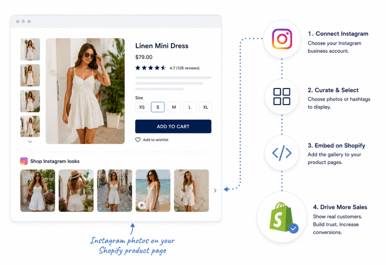
How do I add Instagram posts to Shopify?
You can add Instagram posts to Shopify by using a Shopify Instagram feed app, a UGC platform, manual embed code, or a custom theme section. For conversion, the best setup is usually product-specific: show Instagram posts that feature the exact product being viewed rather than a generic instagram feed on every product page. This supports social proof, UGC for PDP conversions, and shoppable content instead of simply decorating the PDP.
What are the most common Shopify mistakes to avoid?
Common Shopify mistakes include using too many apps, ignoring page speed, relying on generic product descriptions, hiding shipping and return policies, failing to optimize mobile UX, and not making reviews or UGC easy to find. Stores also often add social widgets, Instagram feeds, or shoppable apps without checking whether they improve user engagement or slow down the page. For bounce reduction, every app or module should earn its place by improving clarity, trust, discovery, or conversion.
Is Shopify $40 a month?
Shopify pricing changes over time and varies by region, billing cycle, and plan. Shopify’s Canadian pricing page currently lists Basic at $37 CAD per month when paid yearly, with higher plans for growing and advanced businesses, but merchants should always check Shopify’s official pricing page for the latest details. The base subscription is only one part of the cost because apps, themes, payment processing, UGC platforms, and development can increase the total monthly spend.
Can I connect Instagram to Shopify?
Yes, Shopify supports connecting Instagram through the Facebook and Instagram by Meta sales channel, subject to Meta’s account, catalogue, and eligibility requirements. Once the setup is approved, merchants can use Instagram Shopping features such as product tagging in eligible posts and stories. Connecting Instagram to Shopify is useful for product discovery, but product page conversion still depends on PDP content, social proof, site speed, trust signals, and checkout flow.
How ming hindi?
This appears to be a mistyped or unrelated search query, possibly meaning “how meaning in Hindi.” In Hindi, “how” is commonly translated as “kaise” or “कैसे,” depending on the sentence. It is not directly related to reducing product page bounce rate, so it should not be emphasized in a serious ecommerce article unless included only because keyword research surfaced unrelated queries.
What is the use of ur?
“Ur” is commonly used as an informal abbreviation for “your” in texting and social media. It can also refer to the ancient city of Ur in historical contexts, but in casual online usage it usually means “your.” This question is not related to ecommerce bounce rate, product pages, or Shopify optimization, so it should be treated as unrelated if it appears in keyword data.
What is the English of how?
“How” is already an English word. It is used to ask about method, manner, condition, or degree, as in “How do I reduce product page bounce rate?” or “How do I improve site performance?” In ecommerce content, “how” queries usually indicate practical intent, which means the article should answer directly before moving into strategy.
What are 10 examples of will?
Here are 10 examples of “will” in an ecommerce context: “The page will load faster,” “Customers will see reviews,” “The PDP will show shipping details,” “The image gallery will lazy-load,” “The CTA will remain sticky on mobile,” “The reviews will improve trust,” “The UGC module will show real customers,” “The product page will reduce bounce,” “The site will improve conversion rate,” and “The checkout process will feel clearer.” In grammar, “will” is used to talk about the future. This FAQ is not directly related to product page bounce, but it can be answered briefly if included from mixed keyword research.
Can I add an Instagram feed to Shopify?
Yes, you can add an Instagram feed to Shopify using an app, embed code, or custom theme section. For bounce reduction, the feed should be relevant, fast-loading, mobile-friendly, and product-specific when placed on PDPs. A generic feed may help brand awareness on the homepage, but product-specific shoppable instagram feeds are more useful on product pages because they support purchase confidence.
Why should you add Instagram feed to Shopify website?
You should add an Instagram feed to a Shopify website when the feed helps shoppers see real product context, customer styling, social proof, and shoppable content. For ecommerce conversion, the feed is most useful when it shows the exact product, supports UGC strategy, and helps reduce uncertainty before add to cart. If the feed is generic, slow, or unrelated to the product page, it may hurt user experience rather than improve it.
What does InstaFeed do on Shopify?
Instafeed-style Shopify apps typically display Instagram posts, reels, or feeds on a Shopify store. Some apps show a simple instagram feed, while more advanced tools support moderation, product tagging, shoppable posts, and UGC galleries. The important question is whether the app improves product page engagement and conversion or simply adds another widget that affects page load time.
How To Add Instagram Posts To Google Sites For Free?
To add Instagram posts to Google Sites, you can usually use Instagram’s embed option for a public post and paste the embed code into a Google Sites embed block. This is different from Shopify because Google Sites is not designed as a full ecommerce platform with product pages, checkout, sales channels, and PDP optimization. For ecommerce, Shopify apps or UGC platforms are usually more relevant because they support product tagging, shoppable content, and conversion tracking.
How to monetize Instagram reels?
You can monetize Instagram reels through brand partnerships, affiliate links, creator programs where available, product tagging, traffic to an ecommerce store, shoppable ads, and social commerce strategies. For Shopify brands, the most relevant approach is often using reels for product discovery and then sending shoppers to a strong product page that continues the same visual story. Reels create attention, but PDP content, social proof, customer reviews, and trust signals help convert that attention into revenue.
How can I embed my Instagram Reels feed on my website?
You can embed an Instagram Reels feed on a website using Instagram embed options, an Instagram feed app, or a third-party widget that supports reels. On ecommerce product pages, embedded reels should be relevant to the product, optimized for site speed, and placed where they support buying decisions. Heavy reels widgets can increase page load time, so test their impact with PageSpeed Insights and monitor engagement in Google Analytics 4.
How do I integrate Instagram photos into my Shopify store?
You can integrate Instagram photos into Shopify through the Facebook and Instagram by Meta sales channel, an Instagram feed app, a UGC platform, manual embeds, or custom theme sections. For product pages, prioritize approved Instagram photos that show the exact product, match variants, and support the shopper’s decision. The goal is not just to connect Instagram to Shopify, but to turn Instagram content into social proof, shoppable content, and conversion support.